Overall, after approaching my practical brief in a new way, I think this brief response has been a lot more successful and I have definitely hit all of the Learning Outcomes more efficiently. As I knew from the start I would not be physically creating the mindfulness space, I think I struggled with how to execute the ideas and how to produce some graphic design work to submit. After re thinking how this could be done, the idea of creating a pitch to put forward to individuals within Leeds Arts University seemed the best option to have as an end product. In order to do this, I still needed to have some design work that would support this. Firstly, it was suggested to look at the design elements that would go into this space, I chose to interpret this and to gather all the information I needed (what design elements would be used within the space) and translate this into an infographics poster. Having this meant I had some design work to submit but also a visual way of presenting my research and information that would be included within the pitch. Moreover, I also chose to create promotional material for this brief which would be used to benefit the students and make them aware of the space available. This also meant I used graphic design skills to create posters which meant I was happy with the work I was going to submit. Also, as I am not physically designing the space it allows the brief to have more substance to it, without it just being written ideas on a page.
Furthermore, I think the work being submitted for this module responds well to the brief as I am creating physical work but also directly linking my work to the essay piece. Therefore, I have created a practical response to my essay and have drawn on the research of how mindfulness can benefit design, using my target audience as university students as I felt these were the individuals that would benefit mostly from it.
Sunday, 4 August 2019
COP3: Project Statement
Project Statement
To what extent can design be used for a person’s mindfulness? I chose this question and theme because over the past few years I have become more aware with the term mindfulness and the positive benefits it can have on a person. Having some knowledge and understanding already surrounding this topic, I knew that this would benefit me in terms of knowing where to look and what to look for research starting points and also the ability to have a sensitive approach to the question and possibly touch upon areas of mental health.
From carrying out this research, it became apparent in the early stages that the responses to the question within my essay would pretty much all be positive and highlight the great extent to which design can be used in relation to mindfulness. Researching into literary sources and websites gave me the chance to look at both practicing designers and professors, getting a good understanding of the positive benefits for a person when they begin to consider mindfulness within their daily lives. Within my essay, I looked at both how design itself can have a positive impact on a person’s mindfulness and also how being mindful can help benefit a person’s design work. With this in mind, it became clear that my initial idea of creating a mindful space where people could go to relax would be an interesting approach to take because I would take the points made within the essay and translate them into a design piece.
Moreover, deciding to create a space for students within Leeds Arts University was becoming a great option because it would allow me to create an environment that draws from what I learnt through writing the essay. From looking at Martino Gamper’s, Design is a State of Mind exhibition, I took from that how he wanted to stress the importance of everyday objects and how they influence a person’s behavior, this was related to my practical piece through figuring out what kind of objects would be most beneficial to include within the space in order to allow students to focus on being mindful and take away their stresses. Another key bit of research that I translated into the design piece was from the Mindfulness Design Company and their article on the key benefits of mindfulness for design. As two key points were focus and creativity, I drew on that within the space created and it allowed me to create an environment where students could focus their mind on something that isn’t university work, whilst still allowing them to be creative.
The conclusions made in both my essay and design piece were that design has an incredibly positive impact on a person’s mindfulness, especially as it allows them to focus their mind on something to take away a lot of stresses they may feel. I think the conclusions made within my essay reflect my practical piece as they highlight the importances of being more mindful and show people various ways in which they can carry out mindfulness activities.
Finally, if I were to make any improvements or do anything differently within this module, I would focus it on the practical element as I think the final outcome could have been executed better if I had taken more time to think about how I could present the ideas through sketches and drawings as I think they are explained a lot clearer through my explanations of why each thing has been designed that way and why I have placed a certain object in an area. I think this can be excused to some extent as I have created design work to back up my ideas for the space and to really show my intentions and thought processes through it, this is heavily shown through the infographics poster.
COP3: Practical- Pitch Presentation Slides


These are the presentation slides that I would pitch to the university in order to make the space happen.
COP3: Practical- Promotional Posters Final

This is a final mock up of how each of the posters would look as a set placed around the university. I am pleased with how they have turned out and think these posters would be a success around uni as they would definitely create some conversation about what the space exactly is, intriguing students to go and find out more about it. The colour scheme evokes calming and relaxing vibes to them, through the two colour neutral pallet.
COP3: Practical- Promotional Posters Development
MAIN POSTER


As well as the other two posters, I still wanted to have a poster that included a bit more information on it. I think if the space is within the university it needs to have the room where the space is set up which I have included within a quick vector plant drawing I have created. I used the same colour scheme through each poster so that it was obvious they were a set- and I think they have worked successfully.

COP3: Practical- Promotional Posters Development


This was a thought I had regarding the promotional posters, they would be placed with a set of 3 around university and would be hung from the celling at A3 size.
I came up with this idea as they almost look like book covers, they're simple and neutral therefore have a calming feel to them. I really like how these two posters are just text with no imagery, I think this will allow the students to really take in the information and consider their breathing techniques.


COP3: Practical- Promotional Posters
Having some promotional posters to advertise the space is something that is important as they can be placed around the university so students are aware of the space being created and know that it exists. It can create a buzz and excitement around something meaning the space will gather up attention.
This also means I will have some graphic design work to submit for this module as that is the key thing to consider in order to pass the module.
What the poster should include:
This also means I will have some graphic design work to submit for this module as that is the key thing to consider in order to pass the module.
What the poster should include:
- Name of space
- Brief description of space
- Mindfulness definition
- Where the space is within the university
- Some imagery/ shapes
- Doesn't have to be limited to one poster, could be a collection
- One with the mindfulness definition on it- don't want to overcrowd the poster
- Another with the information on the space and where to find it
- Neutral and simple colours
- Readable typography
- Minimal text
- Large enough to be seen on posters
Saturday, 3 August 2019
COP3: Practical- Promotional Emails
- I think the emails would be most appropriate coming from the Student's Union because their emails are always incredibly friendly and are to benefit students
- The email should have a friendly and approachable tone
- Clearly state what the space is and why it is being created
- Ask if any students wish to submit any artwork that would be considered to put up around the space
- Ensure the students understand the artwork should evoke feelings of relaxation and mindfulness
- The email could include the infographics poster so students are aware of the design elements and can implement them into the artwork.
What the email should include:
- What mindfulness is and why its important to design (art students)
- What the space is
- Why its beneficial
- Encouragement to put forward artwork that students feel create a mindful and relaxed environment
Reference back to research found through the Mindfulness Design Company that I talked about within my essay because they have a real focus on how practicing in this mindful way can help with design- this will appeal to the students also.
As the space I created will be within Leeds Arts University, then it may be key to consider the points made by the Mindfulness Design company and the benefits of being more mindful and how it helps with design.
1. Creativity
2. Focus
3. Perspective and Empathy
4. Reduce stress and improve positivity
1. Creativity
2. Focus
3. Perspective and Empathy
4. Reduce stress and improve positivity
Email example:
Mindfulness means maintaining a moment-by-moment awareness of our thoughts, feelings, bodily sensations, and surrounding environment, through a gentle, nurturing lens.
Were you aware there has been research carried out by the Mindful Design Company that highlights the benefits of being mindful and how it can help with design.
- It increases your creativity
- Allows you to focus more
- Reduces stress and improves positivity
- Creates perspective and empathy
How does having your very own mindful space within Leeds Arts University sound? A unique place where you are encouraged to relax, unwind and switch off your mind for a while. This space is filled with important design elements that all lead to benefiting your mindfulness, it has been created for students so that you have a space away from your studies to minimise your stress levels.
Mindfulness within design has proven benefits and has been thoroughly researched and each space and corner within the room has been carefully designed to be a positive and uplifting space.
If this space sounds like something you would love to use and would like to contribute to, please reply to this email with any artwork you think would thrive within a mindful and relaxing space.
Thank you for your time,
Your mindful space awaits.
COP3: Practical- Promotional Materials Of The Space
In order for this space to be successful, it needs to create a buzz and excitement around the university, therefore creating promotional poster materials and sending out emails is something important in order for it to be a success.
Creating these materials will benefit the practical side of my module as it means I will be using my graphic design skills to create posters, therefore submitting design work and hitting the learning outcomes.
Also, as I am not physically designing the space it allows the brief to have more substance to it, without it just being written ideas on a page.
Promotional Ideas:
- Poster
- Leaflet
- Email with details
- Email giving students the opportunity to submit artwork to put up within the space
COP3: Practical- Rationale/Brief
Original Brief
For this practical brief and in to relation to the essay titled, ‘to what extent can design be used for a person’s mindfuless’, I have to decided to create a mindful space that will be placed in Leeds Arts University. Through my research for the written brief, being creative was something that came up a lot in relation to achieving mindfulness. Therefore, planning this space to be within a creative university will mean that students can greatly benefit from it, not only for their own mental health but to also give them a positive outlook on their university life and design work being created.
New Brief
In a practical response to my essay titled, 'To what extent can design be used for a person's mindfulness', I have curated a pitch to design a mindful space within Leeds Arts University for students to visit in order to switch off and re-focus their mind. During my research for the essay, being creative was a key thing that often came up in relation to achieving mindfulness. Therefore, by creating the space within an art university allows students to greatly benefit from it. This will ultimately benefit their own design work and outlook on university but it can also hopefully be a step to improve and work on mental health and well-being within university life.
COP3: Practical- What Will Be In The Space?
As I am doing this part of the module again to improve it, I have already researched what would be put within the space I am creating. However, as I have decided to create a pitch, I am going to put together a short presentation that will include the information on what kinds of objects and products I intend to put within the space and how they relate to mindfulness.
A lot of these ideas are also influenced from the research I found in my essay and how to implement mindfulness into design.
As the space I created will be within Leeds Arts University, then it may be key to consider the points made by the Mindfulness Design company and the benefits of being more mindful and how it helps with design.
1. Creativity
2. Focus
3. Perspective and Empathy
4. Reduce stress and improve positivity
1. House Plants
Why?
House Plants Assist in Easier Breathing. Breathing is important when it comes to relaxing and being mindful.
Our body takes in oxygen and releases carbon dioxide when we breathe. During photosynthesis, plants do absorb carbon dioxide and release oxygen. Thus, this opposite pattern of gas use makes plants and people natural partners. So, by adding house plants to the interior spaces, we can increase the oxygen levels inside.
2. The Mindfulness Colouring Book
Why?
Working with your hands is one of the best ways to soothe anxiety and eliminate stress. This stunning, pocket-sized colouring book offers a practical exercise in mindfulness that draws on your creativity and hones your focus.
3. Creative Magazines
Why?
For inspiration, as this is a room within an art university, I think this space should still be incredibly creative and its purpose it to link mindfulness with design. I also think magazines are a nice thing for students to flick through when they want a break from doing their uni work as it allows the mind to switch off and relax, something which is incredibly important.
4. Artwork
Why?
Colourful, positive and inspiring art pieces will be a key to put up around the space. It will allow the mind to relax and focus on something different. This could also be something interactive for students as they could put forward pieces of work that they think would be appropriate within an environment for themselves and to encourage mindfulness.
5. Bean bags and cushions
Why?
Students shouldn't feel limited to sitting on chairs within this space, its purpose is not to create another studio environment it is to create something where they can go to escape and relax.
6. Supplies for sketching and colouring
Why?
As this is still going to be a creative space, students should still have the opportunity to get creative if they intend to. By having art supplies within the space, it allows them to jot down any ideas they may have while being within the space as switching off the mind can lead to new ideas.
COP3: Practical- Final Infographic Poster

This is the final, completed infographic poster which will be used within my pitch to create a space within the university to encourage mindfulness and relaxation. Overall, I am pleased with this poster and I think it really helps with the more technical side of the practical brief as I am not physically creating the space but need as much information and planning to explain the idea and pitch it.
In terms of creating an infographic I think I have done a good job as it definitely responds to the definition of one :
"An infographic (information graphic) is a visual representation of information which aims to make the data easily understandable at a first glance.
An infographic makes minimal use of text and can be a powerful tool for displaying data, explaining concepts, simplifying presentations, mapping relationships, showing trends and providing essential insights. The use of compelling images on an infographic can make what is an abstract idea that much easier to understand (hence infographics popularity in marketing and instruction). Infographics simplify large data sets providing a high-level view and making them easier to digest at first glance. They help convey data in a compact and shareable form."
Thus making the first physical practical outcome of the brief a success. This also means in terms of my re submission I already know I will be submitting 'graphic design' work in order to meet the learning outcomes.
COP3: Practical- Imagery On Infographic Poster


As I chose to create an infographic poster, I needed to ensure I had some imagery included within it as they are visual representations of information included in one place. I chose to include very small imagery, almost pictogram looking as the imagery is usually there to help explain the text. However, the text information was very self explanatory so I thought small images were appropriate so that the poster did not get over complicated.
COP3: Practical- Information Added To Infographic Poster


Once I had decided what colour background to go with for the poster, I then began to add in the information that I put together about each design element that will be a key feature within the space. There was no necessary order I needed to put each bit of information in just as long as it was all there.
The text is definitely legible as I have kept it to the bare minimum and just included bullet points about each element and how that relates to mindfulness. As well as ensuring this poster relates to my essay and discusses how design influences mindfulness, it was important for me to create a professional infographic poster in order to include graphic design within the practical side of my work.
COP3: Practical- Poster Designing, Initial Background


This is the initial poster design and layout I have created in Photoshop, the only information that is included so far is the 'title' of the infographic poster, clearly labelling what the information is about.
I have initially chosen colours at random, however, as I am wanting this poster to be part of a pitch to create a mindfulness space, I am going to change the colours to something that are a lot more calming and relaxing for the reader to view and colours that are more commonly associated with mindfulness.


I think these colour schemes are much more suited to the poster and the information that is included on the poster as I am creating a mindful space, therefore a relaxing and calm environment and it is important that any of my practical work also follows this.
COP3: Information To Include On Infographic Poster
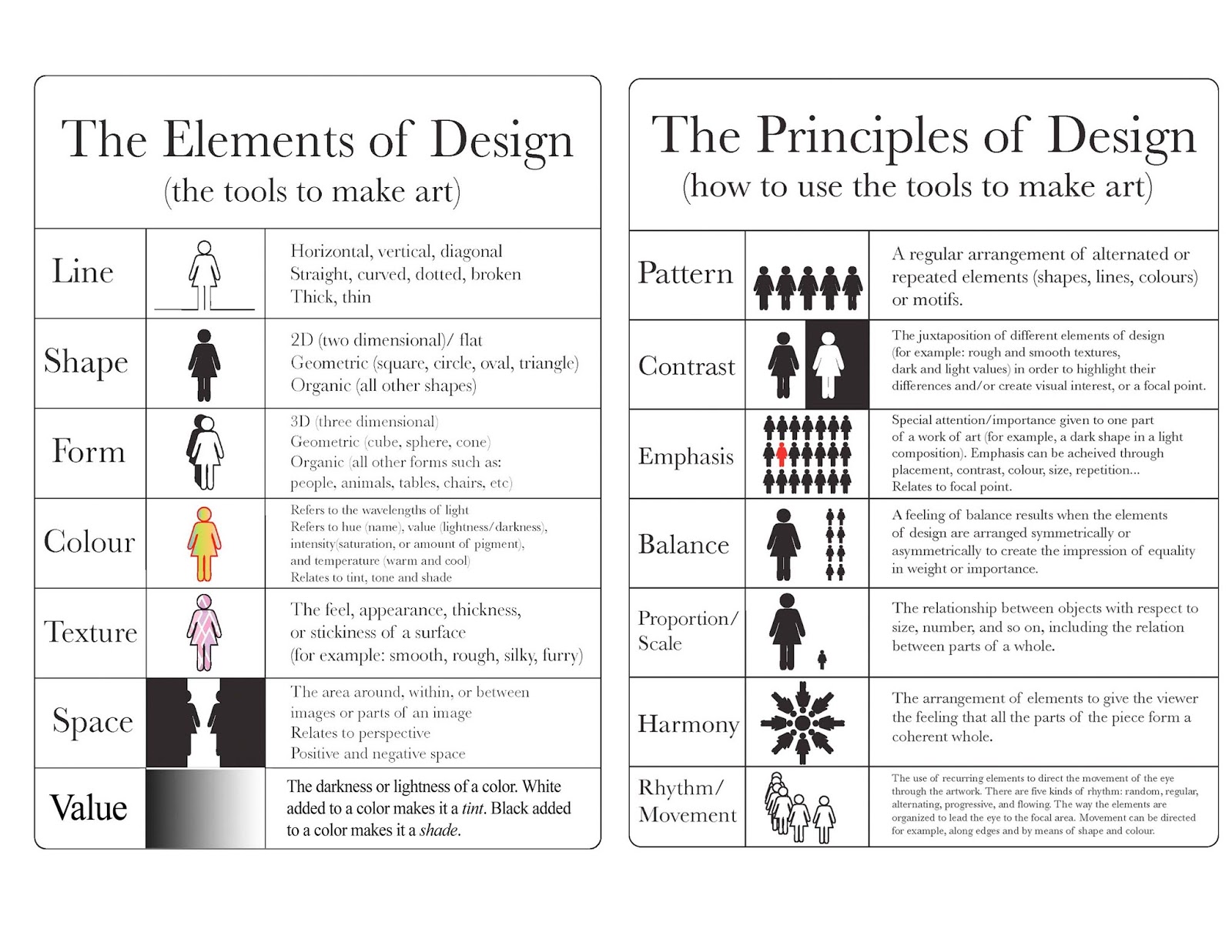
After researching a lot more into design elements and why they are used for certain things, I have carefully considered which of these elements are most important to consider for the space I am creating and will put them all into one place within an infographic poster design.
Instead of the explanation of the design element as I have covered this within my research- I am going to state why they are important to consider for my space and how they each relate to mindfulness or how they can be used in order to benefit mindfulness.
I need to ensure the text is kept to a minimum but explains the point I am trying to make succinct.
This is the information that I will include on the poster.
COLOUR
SCALE
SHAPE
LINES
TEXTURE
TYPOGRAPHY
MOVEMENT
HARMONY
COMPOSITION
Colour :
- Colour instantly creates a mood within the space
- Calming colours will instantly evoke a person's relaxation and mindfulness
- Each individual colour is important, they each say something different
Scale :
- Create emphasis on certain elements of the space
- Draw's a person's attention towards the things they most connect with
- Draw attention to the items that will help each individual person to be mindful
Shape :
- Shapes add interest to a room
- The shape of the room is important to how an individual can interact with it
Lines :
- Used to divide space within the room to allow the person to interact with each element individually
- Helps direct the individual around the space
- Organisation creates a relaxed and mindful environment
Texture :
- Gives depth to the objects within the room
- Interaction and feel puts emphasis on a relaxing environment
Typography :
- Readable information for the individual
- Consideration of Sans and Sans Serif fonts
- Typography will be featured most within the magazines and books in and around the space
Movement :
- Brings the objects to life within the space
- Allows a person's imagination to go wild
- Movement from objects such as plants, creates clean, breathable air within the environment
Harmony :
- All pieces of the design working together 'in harmony'
- Each element works in unison in order for the space's focus to allow a person to consider their mindfulness
Composition :
- Each part of the space has a purpose
- The communication to the audience that the space is to be relaxing and create a mindful environment is clear
- A person can move around the space positively
COP3: Practical- Pitch Idea
As stated in my previous blog post, creating elements to put forward for a pitch is a great way to get across my ideas for the mindfulness space and allow me to put the idea to the university.
What needs to be included:
What needs to be included:
- Rationale (what I want the space to be)
- How it will benefit students (mindfulness)
- Design Elements included in the space (infographic poster)
- What will be within the space
- Promotional material for the space to put up around university (poster/ leaflet/ emails)
After re-considering my practical side of this module, I am already a lot more positive that this will meet the learning outcome as I am directly linking the aspects talked about in my essay but having a lot more consideration to graphic design- through the design elements/ infographic poster/ promotional material.
I also think creating aspects for a pitch is a much better way to approach the practical outcome as it is still allowing me to be incredibly creative and really think about what should be going into this mindfulness project to benefit students.
COP3: Practical- Design Elements Research
In order to directly link the design elements that I think are most useful/ will be considered for the space, I think creating a poster that can be used to pitch the space for individuals within the university, therefore I can directly show how these elements are important and how they link to mindfulness, in order to create the space to its full potential.
An infographic poster would be a good idea as I can state I have submitted graphic design work (alongside other pieces) for this module, which is what it was ultimately lacking- therefore hitting the learning outcome.
The poster should include what design elements can be used within the space and how I will do that through the actual design of the room. As I am not able to physically design the room itself, creating a poster like this with as much information on it will ultimately show my thoughts behind the practical outcome and have as much research and imagery to back up my idea.
* I think ultimately creating a pitch that I would put forward to the relevant people within the university is a great idea for the practical outcome- this means I can submit graphic design responses through imagery and also clearly highlight my ideas and intentions for this space and how really thinking about mindfulness can help the students within the university.
COLOUR
Color is one of the most obvious elements of design, for both the user and the designer. It can stand alone, as a background, or be applied to other elements, like lines, shapes, textures or typography. Color creates a mood within the piece and tells a story about the brand. Every colour says something different, and combinations can alter that impression further.
SHAPE
Shapes, geometric or organic, add interest. Shapes are defined by boundaries, such as a lines or color, and they are often used to emphasize a portion of the page. Everything is ultimately a shape, so you must always think in terms of how the various elements of your design are creating shapes, and how those shapes are interacting.
LINES
Lines are useful for dividing space and drawing the eye to a specific location.
SCALE
Draws attention to and from certain elements/ creates emphasis. The relationship between objects with respect to the size and number
TEXTURE
Creates depth to designs. All about the feel and appearance
TYPOGRAPHY
Consider sans serif and serif fonts, size, colour, kerning, composition
COMPOSITION
Where all the elements of design come together. Important things to consider when it comes to composition: Is the design balanced? Does the design have logical hierarchy? Does the eye follow over the page/s easily and logically? Is my main communication clear to audiences? by using different combinations, techniques, and content you are able to create an infinite amount of layouts.
HARMONY
Harmony is “The main goal of graphic design,” according to Alex White, author of “The Elements of Graphic Design.” So, you know it must be important. Harmony is what you get when all the pieces work together. Nothing should be superfluous. Great design is just enough and never too much. Make sure all the details accord with one another before you consider the project complete.
COP 3: Practical- Design Elements Research
My feedback suggests to look at the elements of design and how I can apply them to the space that I am creating.

https://www.canva.com/learn/design-elements-principles/
http://blogs.bethel.k12.or.us/msymonds/multimedia-classes/animate/carp-rules/
COP 3: What I have taken from my feedback
Looking at my feedback and how I have interpreted it, I think I need to carefully consider what design elements can be used within the space in order for my practical piece to be more graphic design based and also create some promotional material for once the space is open so that students are encouraged to come into the space and know it exists.
Design Elements of the space: (what I think)
Design Elements of the space: (what I think)
- Typography
- Composition
- Layout
- Wayfinding
- Imagery
- Posters
- Magazines
- Interactive material
Design Elements (influenced by research)
- Colour
- Typography
- Shape
- Balance (symmetry and asymmetry)
- Scale
- Texture
- Line
- Negative space
- Framing
- Composition
- Movement
COP3: Looking at my practical again

Looking at this post for my final practical outcome, I can instantly see why this did not meet the requirements to pass. It is a very weak piece of work and does not show any of my graphic design skills and I now need to carefully think how to improve or change this practical outcome as it is very poor.
Within the notes on how to improve, it states it would have made more sense to consider what design elements can be used in the space in order to improve mindfulness and further considerations about how to promote using the space.
At this point I am struggling to decide whether to stick with this idea of a creating a mindfulness space or to change it up entirely. If I decide to change it up entirely however, it would become a very complicated project for me as I have already researched and thought about creating this space for the practical side of the brief.
COP3: Resubmission 12/8/19
As I did not pass this module I am re-submitting it.
The area which led me to a low mark was my practical and outcome 6A4 which I only got 35% in.
Demonstrate a critical understanding of the synthesis between the theoretical and practical contexts of their own creative concerns. (knowledge and understanding / innovation).
This is the key thing I will work on as in my feedback and what I can do to improve it says my practical work contains no graphic design and it would have made more sense had you considered what design elements can be used in such space in order to improve mindfulness as well as further considerations about how to promote using the space.
My module assessment feedback states:
Your work has failed to develop a satisfactory understanding of the relationship between the theoretical and practical contexts of your practice. A conceptual relationship between the theoretical and practical elements of the module is neither explicitly defined nor developed, leading to a failure of your project to fully meet the requirements of the brief.
My next steps are going to be re thinking a way to do the practical side of the brief in order for it to show graphic design elements and to move the mark higher from 35% in order to pass the module.
Subscribe to:
Comments (Atom)